top of page


Team
Role
Timeline
Skills
Solo Project
Product Designer
Sep - Dec 2025
Sketching
3D Modeling (Solidworks)
3D Printing
Prototyping
CMF
Photography
Context
Project Brief
This was a solo project developed for my Industrial Design studio course (ARTD 301), where the goal was to design a calculator using a provided printed circuit board to expand the product assortment for an established brand.
For this project, I chose to work within New Balance’s identity, drawing inspiration from the brand’s emphasis on performance, innovation, and a timeless, authentic visual language.
My Design Process
Here are the steps I followed...
1. Brand Research
2. Ideate
3. Create
4. Develop & Refine
5. Prototype
6. Reflect
Research
Inspiration
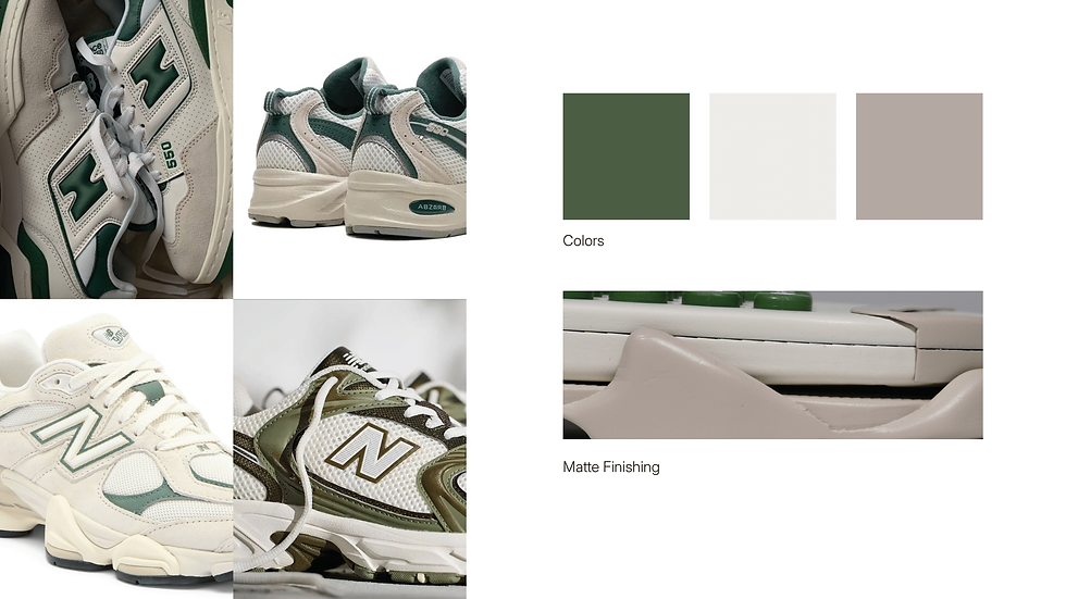
After researching the brand, I came to a few key conclusions that shaped my inspiration. Many New Balance shoes use neutral color palettes with a soft pop of color, along with irregular, sculpted contours that give the products a distinctive, dynamic, and authentic feel.
Ideation
Initial Sketches

First Version
The first render of the 9160C was created entirely before any physical testing. The original concept aimed to showcase a dynamic profile view inspired by the midsole, combining elements from different shoe models while incorporating neutral colors with a pop of green.
During development, it became clear that the screen was too large for the actual calculator display and PCB, prompting several iterations to adjust the proportions later on in the design process.
Development
Form Refinement
Entering the manufacturing process, I focused on form refinement by repeatedly 3D printing the top shell to test it with the actual screen and provided PCB.
These iterations helped evaluate fit and alignment, allowing me to identify and make the necessary adjustments to the screen size and overall proportions.
Another thing I focused on further developing and providing a clearer purpose was the midsole design. In the first version, it served mostly a decorative role, which ended up feeling a bit disruptive to the user experience.
For the second iteration, the form was refined to be more dynamic and smooth while also creating a functional platform for the calculator to sit in, similar to how a sneaker’s sole provides structure and stability.

Prototyping
1. 3D printed, sanded, and added primer to all components.

2. Spray painted


3. Cut vinyl to make stickers for the numbers.
4. Assembled all parts.


Reflection
What Have I Learned?
1. Designing for appearance vs function and manufacturability
-
Learned the importance of balancing visual appeal with real world functionality and manufacturability.
-
Working with actual components highlighted how even small design decisions required multiple iterations to ensure proper fit, usability, and technical feasibility.
2. Understanding brand visual language and identity
-
Gained experience translating an established brand’s visual language into a new product category.
-
Learned how color, form, and finishing contribute to a cohesive and authentic design that aligns with brand values rather than relying on surface level aesthetics.
3. Being patient during the finishing process.
-
Learned that sanding, filling, priming, and painting take time and precision, especially under a tight deadline.
-
This process strengthened my time management and gave me a deeper appreciation for the detail required to produce a polished product.


bottom of page